Print & Signage
VINYL CUTTING & SIGNAGE
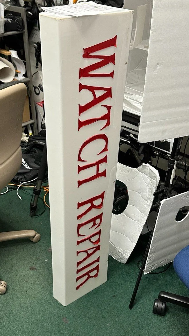
BEFORE
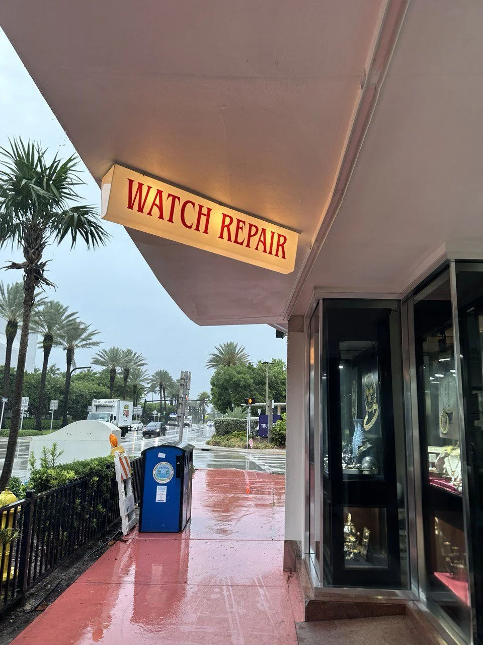
AFTER
Custom Fabrication | Signage Installation
This project involved the full restoration and redesign of an exterior storefront sign for a watch repair shop. The process began with resurfacing the original sign face, followed by precise vinyl cutting and letter application to ensure long-term durability and legibility.
Before: The original sign surface showed wear, misalignment, and aging vinyl.
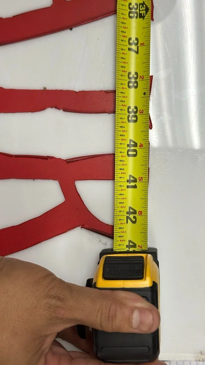
Process: Vinyl lettering was carefully measured, cut, and reapplied using a custom typographic layout. The lettering was scaled and positioned to match the housing dimensions.
After: The final result features bold, high-contrast red text on a clean background, mounted and lit for visibility in both day and night conditions.
Tools & Techniques:
Vinyl cutter + weeding tools
Surface prep and adhesive layering
Measurement and scaling for large format signage
Exterior weatherproofing considerations
This project showcases hands-on fabrication skills, attention to detail, and an understanding of how signage can effectively enhance curb appeal and brand clarity.
*

Gray & Sons Visual Content Design
Luxury Retail Design | Print & Digital Campaigns
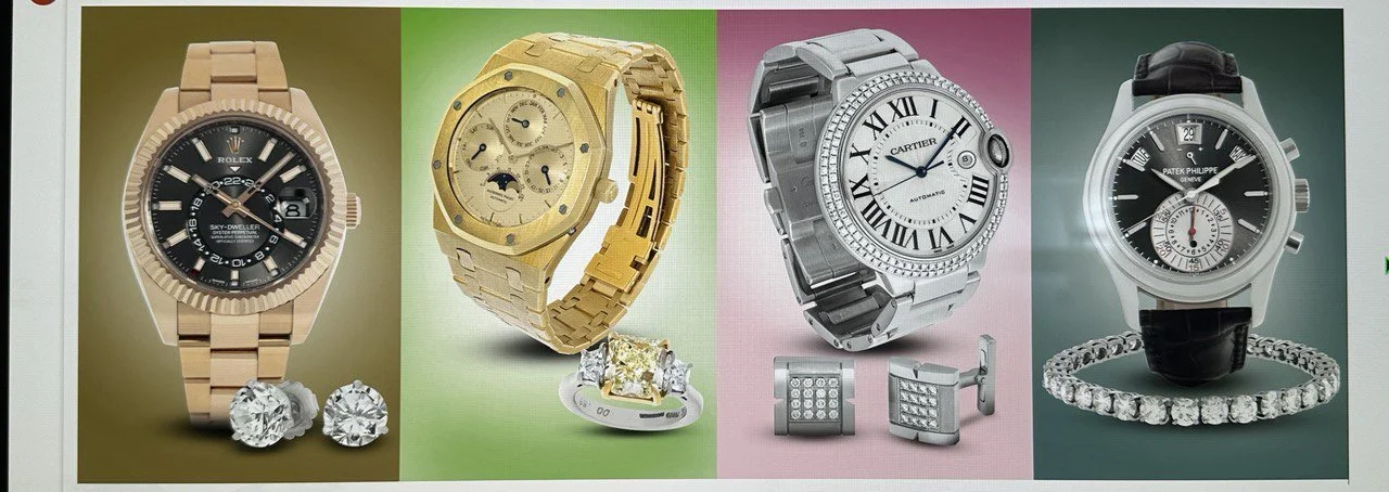
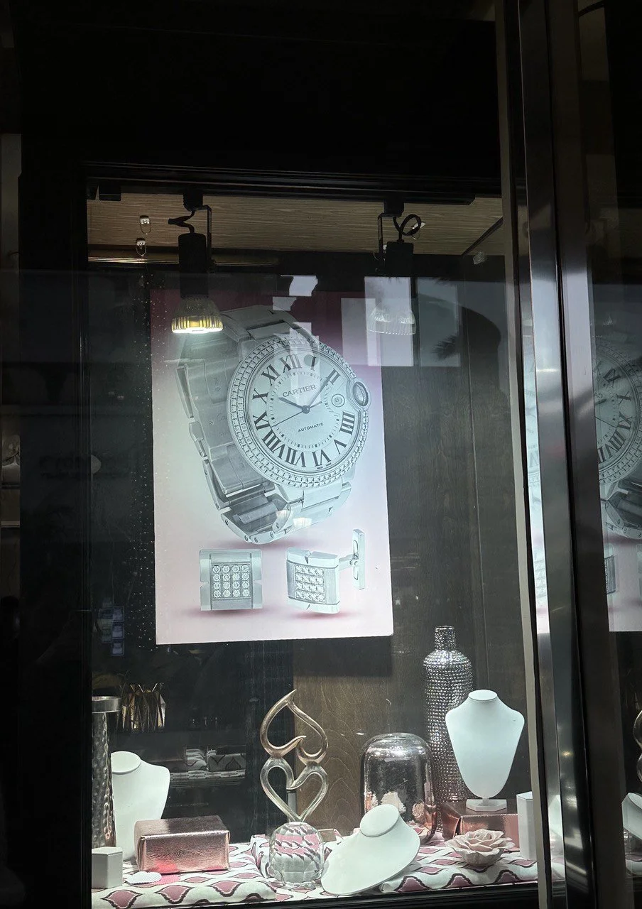
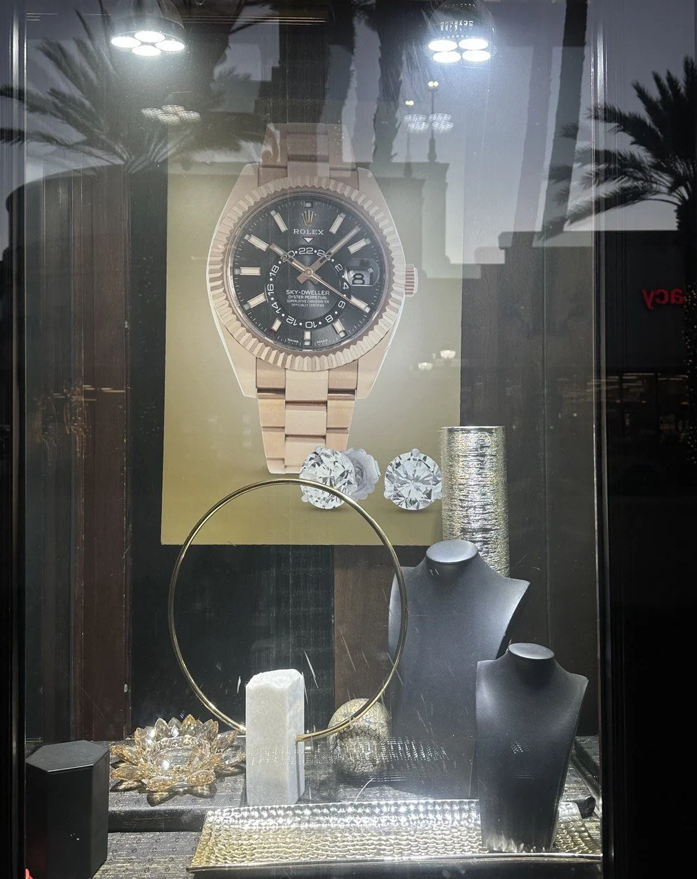
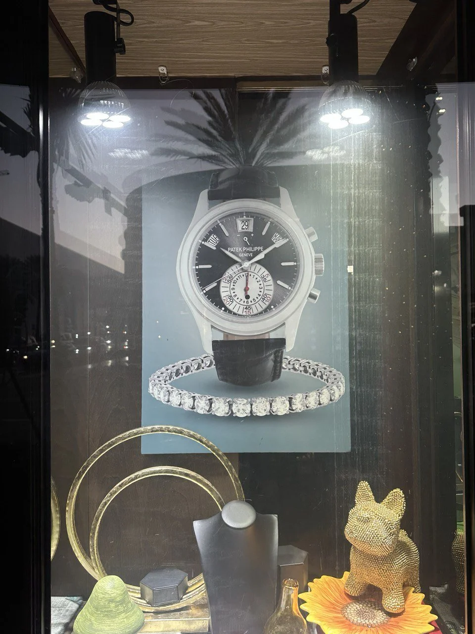
This body of work reflects a multi-platform visual strategy for Gray & Sons, a high-end jeweler specializing in luxury watch restoration and resale. The project encompassed creative direction and production across both digital and physical formats.
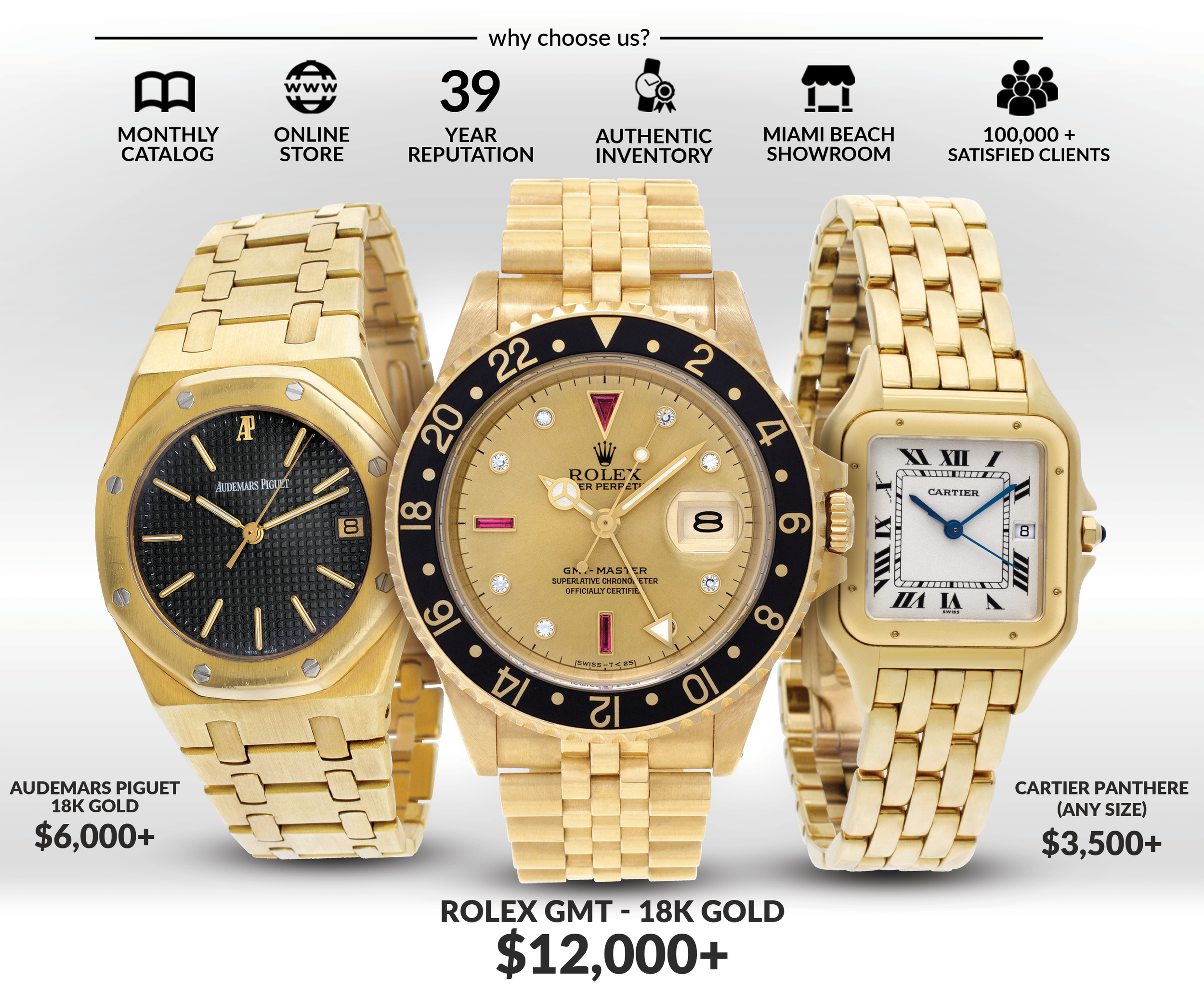
Window Display Posters: Designed high-resolution, large-format posters to feature signature timepieces and seasonal promotions. These were installed in storefront display cases, aligned with jewelry layouts and lighting to enhance visual merchandising.
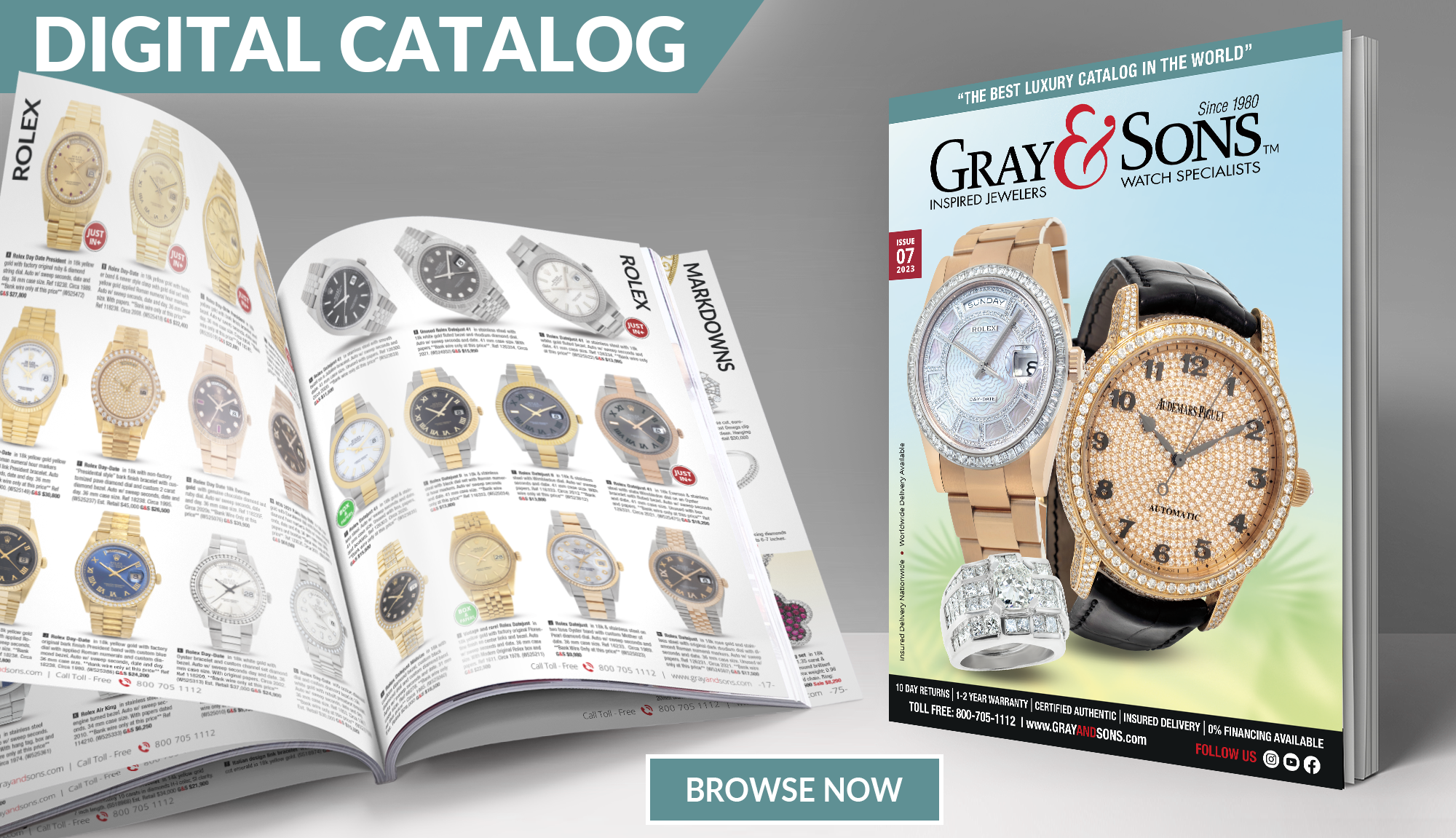
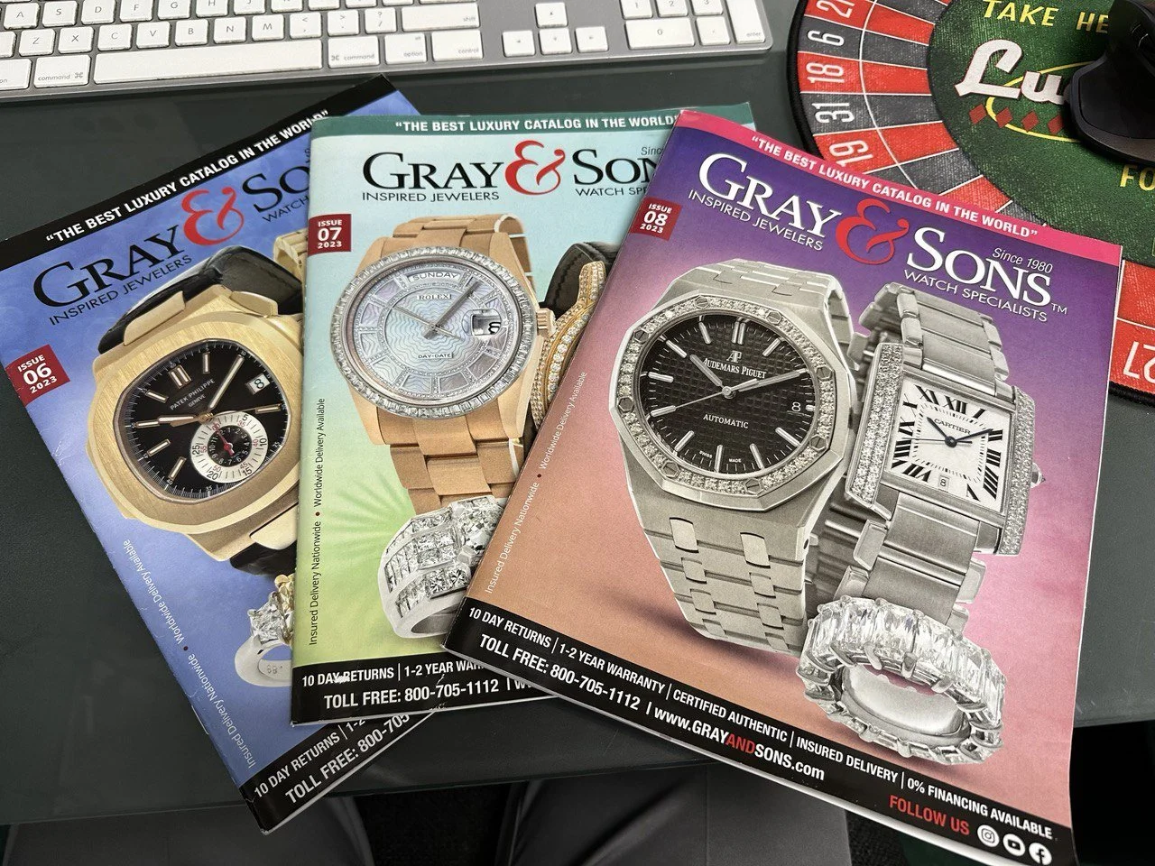
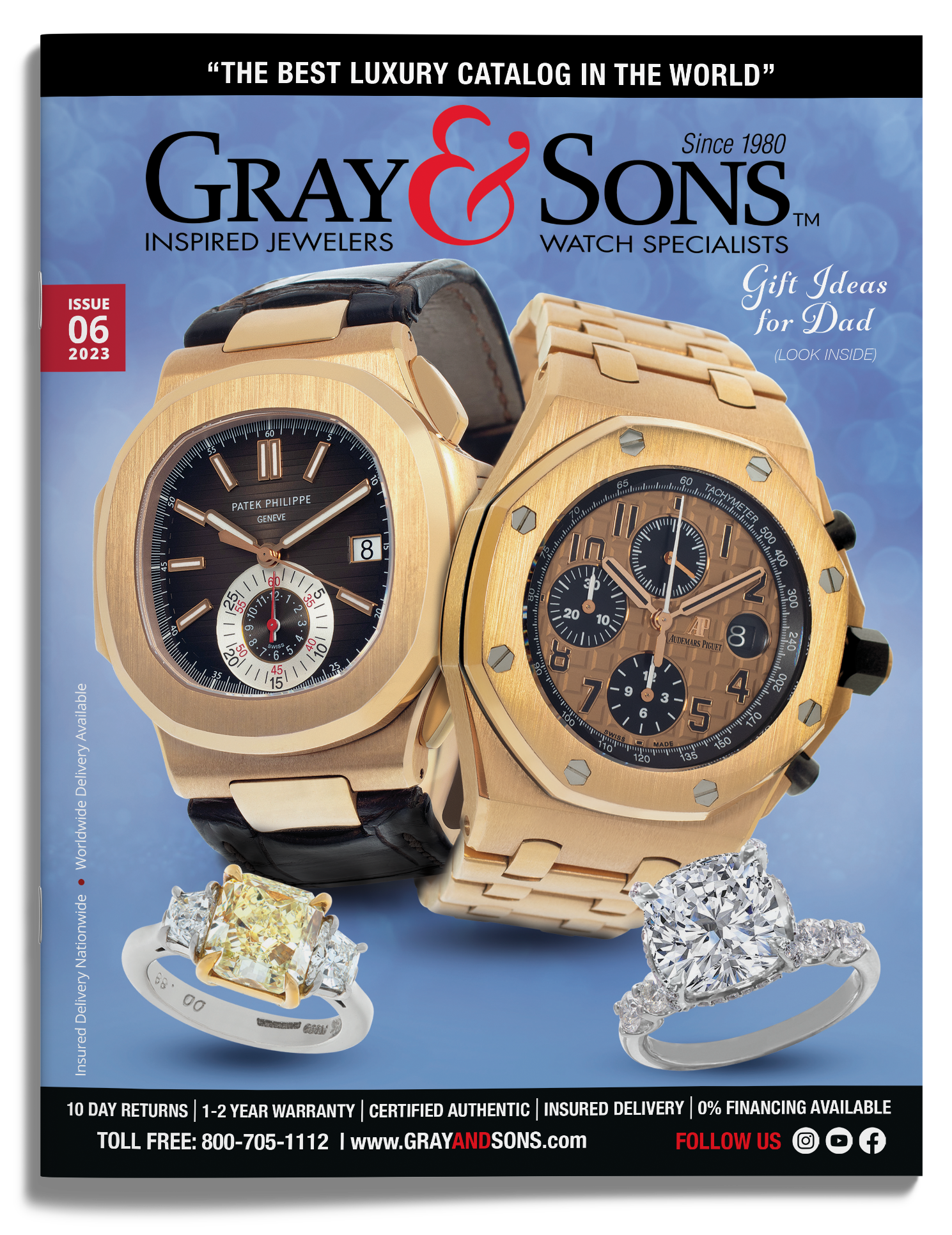
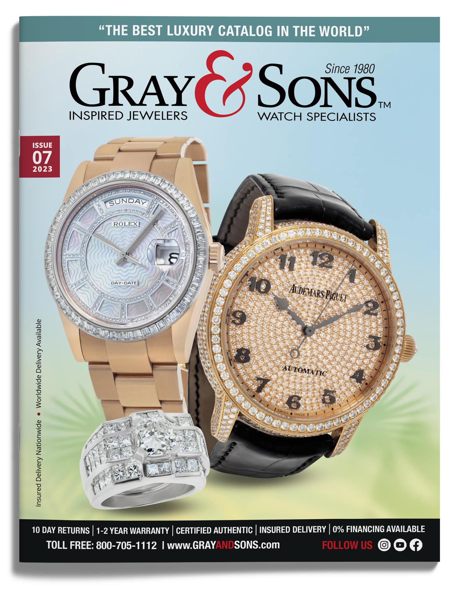
Print Catalog Layouts: Created monthly print and digital catalogs considered to be “The Best Luxury Catalog in the World.” Responsibilities included layout design, photo editing, typographic styling, and press-ready formatting to meet premium print standards.
Brand Consistency: Ensured cohesive visual identity across editorial spreads, in-store promotions, and marketing materials while maintaining Gray & Sons’ upscale aesthetic and long-standing heritage since 1980.
Tools & Skills Used: Adobe InDesign, Photoshop, Lightroom Print production workflows Catalog pagination & color correction Window merchandising collaboration. This project demonstrates attention to luxury branding, cross-medium execution, and high-end client presentation.